


A woody approach to the awards - with high quality results
Author: Tony White, Chair of Judges
We have come through an unusual year for all of us with Covid-19 affecting our lives in many ways. We have seen highs and lows, we have had to modify the way we do things at work as well as in our everyday lives. It has been a year of postponed industry events with virtual meetings keeping the label industry alive and informed. We approached the judging in 2021 much better prepared than last year managing to complete the judging as close to normal as possible. The final decisions relating to the award winners were made during a virtual meeting of the judges on the 12th of May. The Category, Group and the Best In Show awards were announced on the last day of the FINAT ELF (European Label Forum) on the 4th June 2021 during a virtual presentation.
This year, I noticed that more labels than usual were exhibiting a touch of humour in their design, mainly in the drinks and cosmetic categories. Maybe this is an unconscious reaction to the pandemic?
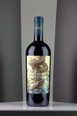
The design of the Best In Show label for the 2021 FINAT Label Competition was an eye-catching illustration of a twisted tree trunk reaching to the sky, OR was it an imaginary imitation of a golfer taking a massive golf swing? These questions came to the forefront of the jury members’ minds during the judging process and no firm conclusion was reached. We leave the viewers to make up their own mind as to the intention of the designer. The more one looks closely at the total label the more detail becomes apparent. One discovers hidden farmhouses, stone archways leading to the depths of the landscape. Furrowed fields and the hint of a country village can be seen in the distance. A great design added to all this detail meant that Priorat Sobre Todo entered by Etiketten Carini, Austria was unanimously selected by the panel of judges as the Best in Show winner. The use of AM screening added an extra level of interest by creating a copper plate engraving effect. When the label is viewed at an angle a whole raft of transparent foil images are revealed. Copper foiling and a degree of debossing bestows a quality look to the final result.
(This label also won the Marketing/End-uses group Award at the 41st Annual Competition and spearheaded a host of high-quality entries throughout the whole competition.)
The competition is organised on an annual basis by the international European Label association FINAT and as usual enjoyed the services of an expert and dedicated team of judges led by Tony White of AWA Consulting. The judging panel consisted of Murat Sipahioglu of Fin Etiket, Steve Wood of Steve Wood Services and visiting judge Noel Mitchell, FINAT Technical Advisor.
The competition attracted 222 entries from 46 companies representing 27 countries worldwide. In addition to the 5 Group winners and the 23 category winners a total of 81 Highly Commended certificates will be distributed later in the year. The number of countries entering this year was led by France with 25 entries followed by Austria with 20 entries. The number of entries in each category was again led by Wines (58), Alcoholic Drinks (45), Cosmetics (22) closely followed by Sets of labels (19). The steady march of digital printing was noticed in the Marketing Group with 88 of the 108 entries involving digital in one form or another. Throughout the competition 83 entries were printed solely using digital technology.
Group Winners
The Group winners are organised, as usual, into the following five main groups including Marketing/End-Uses, Printing Processes, Non-Adhesive Applications, Innovation and Digital Printing.
The Winner in the Marketing/End-Uses Group was Etiketten CARINI GmbH, Austria for Priorat Sobre Todo. This label is getting near to the top of the quality ladder and is almost wasted on a bottle as it merits more attention than just selling a wine product. The use of AM screening adds a degree of interest to the label which one would not expect to get with FM screening techniques. Hold the label at an angle and another world of transparent foil images appears adding yet another layer to an already technically busy label.
Unusually, in fact the first time in the history of the FINAT Label competition, the jury decided to award two group winners in the Printing Processes Group as they found it impossible to separate the two entries.
The first winner was Multi-Color Montreal Canada Corp, Canada for Valley of Mother of God. This clean looking, well-printed label in five colours uses offset lithography to achieve the quality result required for this product. A fairy tale image is used to emphasise the simplicity and purity of the gin. A whole raft of converting techniques including hot stamping, de-bossing and a very special die-cutting format all contribute to the effectiveness of this label. The gold seal adds that extra touch of class to the end result.
The second winner was DGS Baski Teknolojileri A.S., Turkey for Dalin Dü? Bahçesi. Printed in seven colours using flexography this converter has captured the colour of the baby’s skin tones perfectly. The combination of the yellow chick and the pink towel complement each other very well and adds further interest to an already busy label. An overall gloss varnish adds a degree of protection to the label during use.
The winner of the Non-Adhesive Applications Group was Azimut, Russia for Coffee Doypack Giraffe. There is no mistaking that the giraffes are at the focal point of this flexible packaging pouch. The black and white images are given an extra lift by being printed on a matt metallic substrate. The background is relieved by the addition of a gloss lacquer pattern on the front of the pack.
The winner in the Innovation Group was Schreiner Group GmbH & CO KG, Germany for CPT Patch (Plasma Patch for the treatment of chronic wounds). An ingenious medical application from the label industry for the treatment of chronic wounds. The Cold Plasma Patch creates a cold plasma ionised gas within the patch. The patch is placed on top of the wound and is connected to an electricity supply. The combination of the gas produced and UV and IR radiation stimulates the wound healing process by killing bacteria and germs. Treatment times are reduced to about 2 minutes. A complicated label to produce, a self-adhesive layer is integral to the production process. Using label technology the patches can be produced in a fast, cost-efficient way using a roll to roll manufacturing process.
The winner in the Digital Printing Group was MCC Label Paarl, South Africa for Cape Fynbos Gin. Once this label is on the bottle the reality of the “perforations” will encourage the consumer to try and peel off the “stamps”. In fact, it is very clever and accurate black varnishing that adds that touch of realism. However, just to add to the confusion the perforations around the edge of the label are genuine! Apart from that the information about the plants biome educates the customer. One cannot help but admire the exact detail in the illustration of the plants.
This year, the Judges Award was given to Etivoet, Belgium for Shower Power. A fairly straightforward flexo label printed on both sides in seven colours on a filmic substrate. The interest is in the application of asking the consumer to remove the label and recycle the label and metal can separately. This is a step towards reducing the complexity of the recycling selection process. In addition the label has the protection of a recyclable varnish and adhesive.
Breakdown of number of Winners and Highly Commended Awards by Group
|
Winners |
Highly Commended |
Total Awards |
Total Entries |
|
|
Group A |
15 |
59 |
74 |
185 |
|
Group B |
3 |
12 |
15 |
13 |
|
Group C |
2 |
6 |
8 |
17 |
|
Group D |
1 |
- |
1 |
1 |
|
Group E |
2 |
3 |
5 |
6 |
|
Totals |
23 |
80 |
103 |
222 |
Summary of the entries from the top ten countries and the number of awards they received.
| Country | No. Entries | % of total entries | No. Awards |
|---|---|---|---|
| France | 25 | 11,2% | 12 |
| Austria | 20 | 8,9% | 10 |
| USA | 16 | 7,2% | 5 |
| Russia | 16 | 7,2% | 5 |
| Sweden | 16 | 7,2% | 4 |
| Turkey | 13 | 5,9% | 6 |
| Australia | 11 | 4,9% | 6 |
| Poland | 11 | 4,9% | 1 |
| Spain | 9 | 4,0% | 7 |
| Greece | 9 | 4,0% | 4 |
Videos of all nominees and winners are posted on the FINAT YouTube channel:
https://www.youtube.com/watch?v=UMeWT6r2yjw&list=PLVH-Qwq675VWk0dZXfoeG2fIAMAz1VrlW
Judges’ Comments on the Category Winners
Group A Marketing/End-Uses
A1 Wines
Joint Winners
Etiketten CARINI GmbH, Austria for Priorat Sobre Todo
An eye-catching label with a twisted tree (or is it a man) as the central figure. The use of AM screening and the smoothness of the six colour offset lithographic printing process adds an almost copper plate engraving appearance to the label. The use of a transparent foil (best viewed from an angle) gives the label added interest. The use of copper foil and debossing bestows a quality look to the final result.
Marzek Etiketten+Packaging GmbH, Austria for Kellerkatze Maine Coon
The Maine Cool cat breed is basically a night hunter. This simple illustration depicts a black cat staring at a full golden moon. Digitally printed in five colours plus hot foiling for the moon. The contrast between the two main components of the label gives a visually effective appearance.
A2 Alcoholic Drinks
Joint Winners
Marzek Etiketten+Packaging GmbH, Austria for Stiegl Hausbier Nr. 37
This is a very busy digitally printed label full of information. The colourful mid-section tells the story of the manufacture of the beer and balances the two information panels very well. The black type is particularly clear and legible and the matt varnish gives a comfortable look to the end result.
Skanem Skurup AB, Sweden for Farsta I Love You 5.8%
A very colourful label using inkjet technology to produce a high-quality result. Great definition in the black type and high quality, close registration makes this label stand out from the crowd. The overall gloss varnish gives an added quality to the end result.
A4 Food Products
Joint Winners
Marzek Etiketten+Packaging GmbH, Austria for Bio Hanföl
A busy and informative label printed digitally in four colours. The dominant green colour in different shades adds interest and re-enforces the product’s bio pedigree. The overall gloss finish is achieved by lamination to protect the label in use.
Stratus Health & Beauty, France for Borde Black Truffle
A dramatic looking label using the contrast between the black background and the white type and logo to attract the eye. The gold foil band with black lettering and the small white band maintains the customer’s interest. The label looks great on the bottle. Printed in six colours using flexography gives high-quality results.
A5 Personal Products
Stratus Martin, France for Candela Jasmin d’Orient
At first glance a simple looking label but it has hidden quality. The symmetric shapes within the label each containing a subtle colour and blind debossing creates a high degree of interest. Printed digitally in four colours on a pink, rose coloured substrate the fineness of the gold foiling and the accurate debossing add even more quality to the end result.
A7 Industrial Products
Schreiner Group GmbH & CO KG, Germany for Display Protection Film
A straight forward Information label printed in a single colour. The label is intended to be used to provide information in various workplace scenarios including manufacturing area and educational or medical facilities etc. The filmic substrate gives protection against dirt and scratches. The label can be removed without leaving any traces of adhesive residue.
A8 Automotive Products
Schreiner Group GmbH & CO KG, Germany for Self-adhesive Insurance Plates for Small Motorcycles
This label is a resource saving solution to the annual replacement of aluminium motorbike licencing/number plates in Germany. The filmic “licence plate” needs only a metal base plate for the first year. In subsequent years the easily produced filmic plates with an adhesive are used to update the annual licence. For security purposes there is the potential to embed a holographic security feature.
A9 Cosmetic Products
Joint Winners
Stratus Martin, France for Nayomi – Silver Pearl Hair Mist
An attractive looking label printed digitally in 12 colours plus silver foiling which adds a touch of luxury. The front of the label has the product and suppliers names encapsulated in a silver circle ensuring the eye is drawn to that information. The information panel is backed by a dominantly purple swirling design which is an ideal backdrop for the extremely sharp type and Arabic lettering.
Germark SA, Spain for Infusion
A deceptively simple label which hides the subtle build-up of several layers of silk screen printing to simulate a fabric look. The final image is printed using flexographic printing in two colours. The metallic substrate imparts an attractive sheen to the final printed result. The tactile effect is achieved by using a tactile matt varnish.
A10 Pharmaceutical Products
Schreiner Group GmbH & CO KG, Germany for Patch-Safe Label
A complex multi-layer label designed to allow the safe use of a medical patch containing critical pain management medication. This label allows for the safe use of the patch and the subsequent safe disposal of any remaining opioid drugs which in the wrong hands could be subject to abuse.
A11 Security Products
Eltronis, Romania for Tamper Evident Seal with Engage™
This tamper evident label is designed to protect a whole raft of products including medicines, high value beauty products with several layers of security. A hidden QR code revealed when part of the label is removed allows the consumer to gain access to additional security or product information.
A12 Booklets
Germark SA, Spain for Bio-Grow
This label has a strong product identity with the green lettering and company logo. The dominant green colour emphasises the organic basis of the contents. As with any fertiliser products safety information and instructions for use are required to meet legislation. This two page label does just that in 13 different languages. It is interesting to note that the background on the front of the label simulates the natural fibres found in agricultural areas.
A14 Self-Promotional Labels
Dars 91, Bulgaria for Love Tuition by Dars
A delightfully simple label digitally printed in four colours in five passes through the converting process. When the main heart layer is peeled back a simple message is exposed and a pleasant scent is released. This demonstrates a novel way for Dars to show a potential customer their ability to offer something different.
A15 Sets of Labels
REYNDERS Label Printing, Belgium for Dada Chapel
These two labels digitally printed in seven colours introduces unusual alcoholic drinks with a touch of humour. The company logos are printed in black on the reverse side so that they are visible through the clear liquid in the bottles. Embossing, hot foiling and a tactile varnish add value and interest to the finished labels.
Group B Printing Processes
B1 Flexography
DGS Baski Teknolojileri A.S., Turkey for Dalin Dü? Bahçesi
Printed in seven colours using flexography this label captures the colour of the baby’s skin tones perfectly. The combination of the yellow chick and the pink towel complement each other very well and adds further interest to an already busy label. An overall gloss varnish adds a degree of protection to the label during use.
B4 Reel-Fed Offset Lithography
Multi-Color Montreal Canada Corp., Canada for Valley of Mother of God
This clean looking, well printed label in five colours uses offset lithography to achieve the quality result required for this product. A fairy tale image is used to emphasise the simplicity of the gin. A whole raft of converting techniques including hot stamping, de-bossing and a very special die-cutting format all contribute to the effectiveness of this label. The gold seal adds that extra touch of class to the end result.
B5 Combination Printing
Etisan Etiket & Matbaacilik San. VE. TIC. Ltd, Turkey for Eyüp Sabri Tuncer Natural Olive Oil Hair Cream
A straightforward label showing a picture of an olive leaf with olives in the centre, but dig deeper and we find that flexo and screen technologies were used to print this label in five colours. There is even more, the veins in the leaf are very tactile through the use of an embossed varnish. A touch of silver cold foil and the brown silk screen type add various layers of interest in the production of this label.
Group C Non-Adhesive Applications
C1 Sleeves
IPE Industria Gráfica S.L.U., Spain for AlineJuvenelle Champagne
A visually stunning sleeve featuring a black, matt background with high opacity white in the detail of the flowers and leaves. Printed in six colours using flexography, the introduction of a four colour image in the midst of the black and white background adds an area of visual relief to the predominantly black background. The gold foiling adds that extra degree of luxury. Overall an outstanding sleeve.
C2 Flexible Packaging
Azimut, Russia for Coffee Doypack Giraffe
There is no mistaking that giraffes are at the focal point of this flexible packaging pouch. The black and white images are given an extra lift being printed on a matt metallic substrate. The background is relieved by the addition of a gloss lacquer pattern on the front of the pack.
Group D Innovation
Group & Category Winner
Schreiner Group GmbH & CO KG, Germany for CPT patch (Plasma Patch for the treatment of chronic wounds)
An ingenious medical application from the label industry for the treatment of chronic wounds. The Cold Plasma Patch creates a cold plasma ionised gas within the patch. The patch is placed on top of the wound connected to an electricity supply. The combination of the gas produced and UV and IR radiation stimulates the wound healing process killing bacteria and germs. Treatment times are reduced to about 2 minutes. A complicated label to produce, a self-adhesive layer is used in the production process. Using label technology the patches can be produced in a fast, cost efficient way using a roll to roll manufacturing process.
Group E Digital
E1 Toner Technology
MCC Label Paarl, South Africa for Cape Fynbos Gin
An extremely well printed label which, at first sight appears to be a set of stamps but in fact the “perforations” are created using a gloss tactile varnish. The content of the label depicts a biome of plants found in South Africa and are characterised by a diverse richness of endemic plant species. Each plant is named for identification. Printed digitally in four colours with a high gloss spot varnish on the plants and the main title.

 Full content available