


Amherst Label and Baxter Brewing Co.: Bringing an award-winning label to life
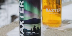
At the 2024 TLMI Printing Excellence Awards, Amherst Label scooped the ‘best-in-class’ prize in the alcoholic beverage category for Baxter Brewing Co.’s ‘13 Below’ Cold IPA label.
Printed on an MPS-Domino hybrid press, the label was recognised by judges for its look and feel, which highlighted the sharp contrast of the high-opacity white print against the metallised film, as well as the tactile, 3D feel provided by the label’s rough textured matte UV varnish.
Creating an award-winning label like ‘13 Below’ takes a combination of partnership, design creativity, technical expertise, and print technology know-how, as Shane Beaton, Account Executive at Amherst Label, and Devin Smith, Sales Marketing Manager at Baxter Brewing Co., explain.
Partnership & connection
Amherst Label and Baxter Brewing Co. have been working together since 2022, when the craft brewery was looking for a new printer for its short-run labels. The partnership has evolved since the companies’ initial engagement, with Amherst now printing nearly all the labels for Baxter’s limited-release beers, including Window Seat, Lady Sasquatch, Yeti Sasquatch, and Coastal Storm.
“Between the 12 and 16oz labels we manage for Baxter, we’re looking at more than half a million labels annually,” says Shane Beaton.
From design concept to reality
Devin Smith, Baxter Brewing Co., explains: “For our 13th anniversary ‘13 Below’ Cold IPA, I was thinking of the sky on a cold winter night. Someone suggested including the Northern Lights, which was a perfect idea. Adding the Northern Lights above the ridgeline and tree silhouettes into the foreground, it all came together.”
For Baxter, it was key for the Northern Lights to stand out, leading to a collaborative brainstorming session where the two teams looked at substrates Amherst had previously used on the Domino hybrid press before agreeing on the reflective metallised film.
“This label turned out way better than I could have imagined,” says Devin. “The reflective film, the printed gradient and the tactile coating that we add to all labels – it all worked well together.”
Shane adds: “The matte UV textured varnish definitely enhances the way the label feels. It also helps when applying the labels to the cans in their high-speed canning line. It runs a lot smoother than other finishes, ensuring the labels are applied securely.”
The right printer for the job
As the ‘13 Below’ label was a limited print run, choosing the right printing technology was an important consideration – both in terms of ensuring the desired label effect as well as making sure it remained cost-effective for the craft brewery.
“In the grand scheme of things, it was a small run, a little smaller than some of the other runs we’ve done for Baxter,” Shane says. “It was 7,000 labels, and they paired it up with 3,000 labels for another SKU, making the total run 10,000 labels. It’s a 5x8” label, and we ran it two across, which came out to about 4,500 feet, running roughly around 97 feet per minute.”
In terms of the printer selection, Amherst has three Domino N610i presses, two hybrids, and one roll-to-roll press, which means the label converter can offer a range of different printing services depending on its customers’ needs.
“Although much of our growth in recent years has been driven by our digital capabilities, it’s important for us and for our customers to have access to both digital and flexo technologies. Every scenario is different, and flexo has its place,” Shane emphasises.
“For the label in question, it would have been possible to produce the design on one of our flexo presses, but as we were producing a small run of labels, this would have worked out more expensive, considering the setup and cost of creating plates for every colour.”
Ink expertise
One thing that Domino is recognised for amongst the print technology community is its colour capabilities, from the opacity of its white inks to its extended colour range, including orange and violet.
“We were able to make those whites appear on the metallised film with a similar look and contrast to knocking out the text on a white substrate – and we incorporated different gradients and screens of white – like the ice and water reflection – into the label design. Domino’s high opacity white ink helped make those gradients more defined,” Devin explains.
“Having the additional colour capabilities definitely helps with projects like this. Having the luxury of running that extended gamut over standard CMYK enabled us to hit the neon green of the Northern Lights much more accurately. Greens can be hard to get right,” Shane adds.